This blog post is inspired by a WorkoutWednesday challenge, which can be found here.
The task was to build a waterfall chart based on the top 5 sub-categories, and to compare this with the other sub-categories by bucketing them all up in “Other”.
We also wanted to show the value for all of the sub-categories together.
Step 1:
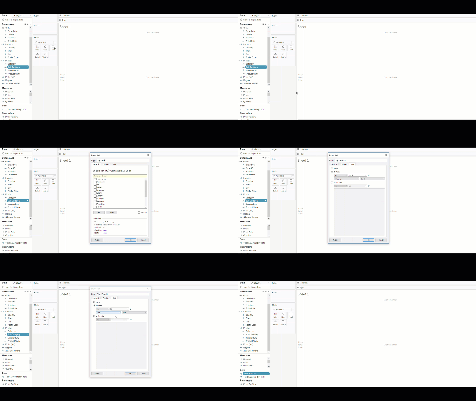
The first thing that I thought of when tackling this challenge is to start with what I know. I know I can create a top 5 list of sub-categories – so I focused on this first.
However, I cannot just filter the top 5 categories in my view, because I wouldn’t be able to compare this with the other sub-categories. So I can’t use a filter.
How about grouping? Grouping would be a great idea to create this “other” field that we are looking for. However, it wouldn’t be dynamic, so if the top 5 changed, then this group would not reflect that.
If not a group, then a set? – YES!
I have to create something that I can reference to in a calculated field to create an ‘if-statement’ saying:
“if a sub-category is in the top 5,
then give me the name of the sub-category
else, group them all up in ‘other'”
Therefore, I decided to create a set, which is dynamic and can be referenced in a calculated field.
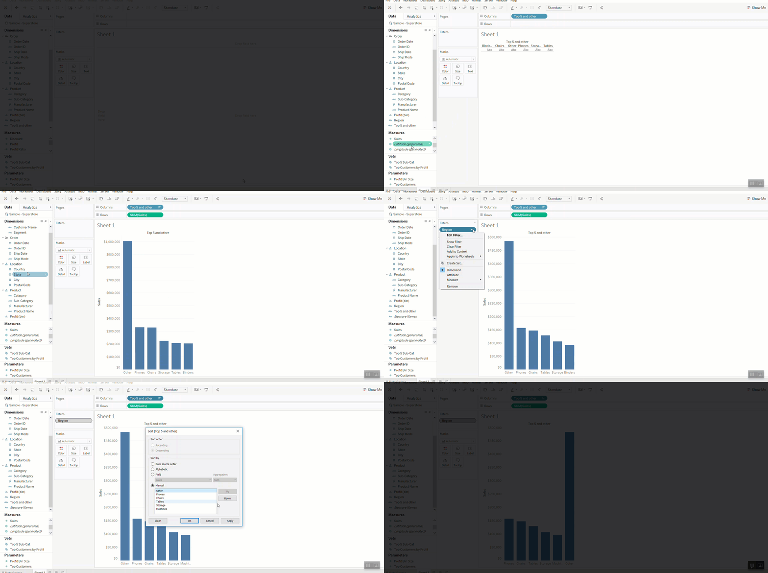
I then created a calculated field that will reference this field, and to create an “other” field.

Then I created my view:
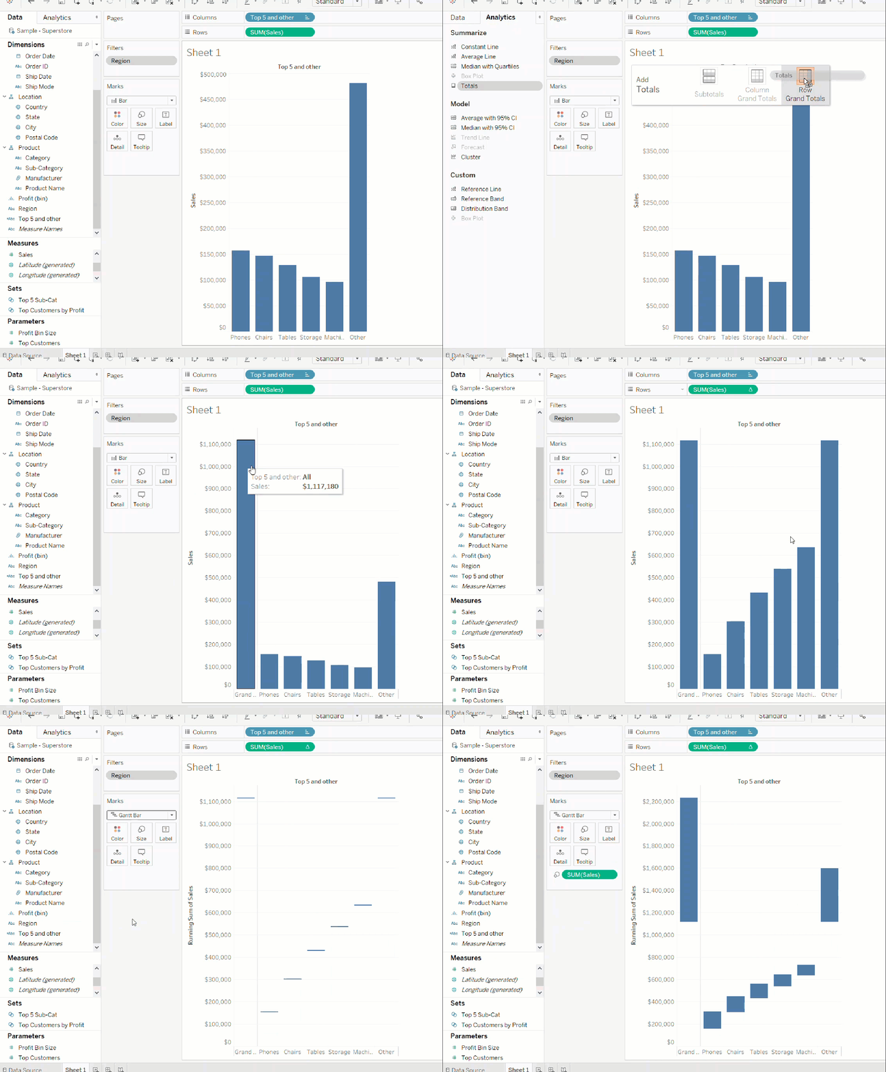
We also need a running sum of the sales across each sub-category.
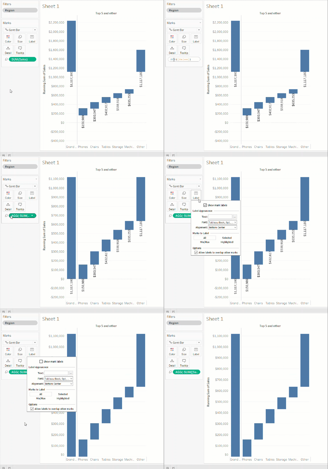
But the problem is that we essentially want floating bar charts from one sub-category to the next. But Tableau doesn’t have that capability. The closest thing to a floating bar chart is a gantt chart. We can then size that to look like a floating bar chart.
Let’s try using a gantt chart and sizing it by SUM(Sales).
However, our waterfall chart looks like it is upside down. This is because, the gantt chart is sizing the bars correctly, however, it is starting from its value. Have a look at the labels below:
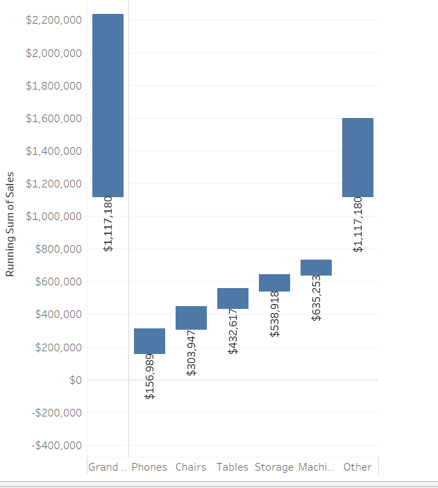
Notice that the bars start from the value of each sub-category. For example, the sales for phones is around $150,000, therefore the gantt chart starts sizing the bars from $150,000 with the direction of the bars going upwards.
This is why it looks like it’s upside down. Therefore, we need to tell the gant bar the direction of the sizing! We need to put a (-) in front of the SUM(Sales).

3 thoughts on “Understanding how to build a waterfall chart in Tableau”